ShopDreamUp AI ArtDreamUp
Deviation Actions


Description
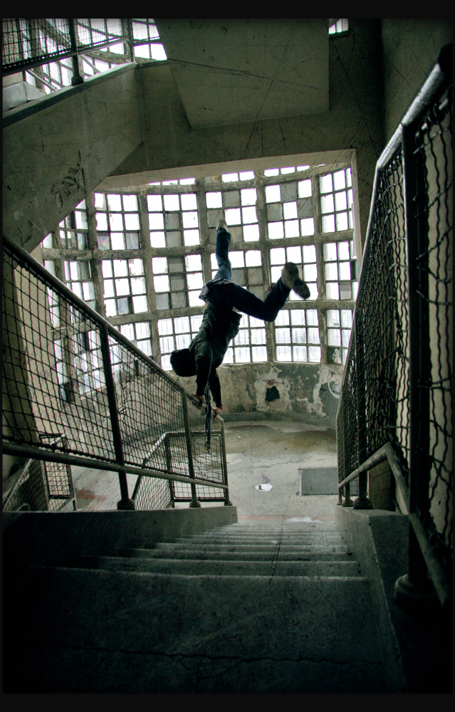
My friend Urosh, Belgrade.
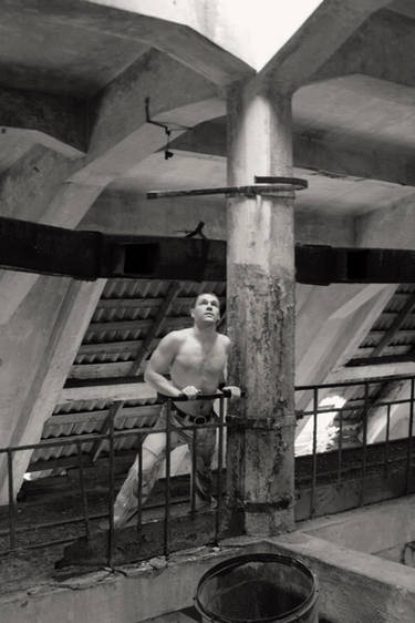
Other photos from that day:


Other photos from that day:
Image size
639x1000px 703.32 KB
Make
Canon
Model
Canon EOS 40D
Shutter Speed
1/197 second
Aperture
F/4.0
Focal Length
17 mm
ISO Speed
400
Date Taken
Feb 20, 2010, 9:45:18 PM
© 2010 - 2024 euphorical-ecstazy
Comments7
Join the community to add your comment. Already a deviant? Log In
This is a great image, I can definitely tell that from my first look on. You’ve done the shot at the perfect time – the captured movement looks great. The exposure is good and the low color saturation looks great in this one because it just supports this “underground” feeling I get from this image (Yeees, I see that it’s not underground at all XD). Did you try it in b/w? Maybe not the usual monotones, but with a bit playing around with the curves. That could create a great look for this one, too. But that’s just a minor idea, nothing you should really change. Both could fit to this image very well, so it’s just playing around a bit. The person is not directly in the middle which makes it more interesting for the eye. (But maybe I would try to do this a bit more “extreme”, because the position is still very close to the middle – a bit more to the left or right) The lines that lead down to the person draw attention to the person and so to the focus of the image which works very well and looks great.
But there’s some stuff you could change to improve the whole look of this image. First thing: It would look a lot bette with the horizontal lines in the back straight. That’s just like when you tell somebody to straighten the horizon – it just looks soo much better. I turned it a bit in Photoshop and checked the look then – and it was definitely better and seemed to be more closed in itself. I really liked it. Of course then the steps are not straight anymore (they’re not totally straight anyway), but this looks so great. Then I would’ve cropped it a bit different – there’s so much around there and the person itself is so small. And the person is the whole thing of this photograph so I would consider it as important that it is shown a bit more. I would’ve cut off some of the walls on the top and a bit of the floor on the bottom. Then there’s a bit less around that can draw the attention away from the focux.
But besides that I can’t think of anything else I would change. Everything else just looks good and fits into the style and concept of this photograph.
Just another idea: Did you try to capture a bit movement? I don’t know which camera you use, but most cameras are able to do that – or to some people it just happens by accident. I think that would definitely look great to, because it is a shot that captures movement in a way. So with blurred (I don’t know how you call it exactly) feet/legs this would express this. (Do you know what I mean? I hope so, otherwise I can show an example)
All in all it's a really nice photograph - I really enjoyed looking at this.
<img class="avatar" src="a.deviantart.net/avatars/team-…" alt="
 " title="The-Photo-Critics"/>